As sociopolitical tensions began rising in the United States, my friend and I frequently found ourselves deep in conversation about representation and intersectionality. Frustrated witnessing how quickly society was regressing, we decided to record these discussions as a podcast.
Creative direction for brand and podcast production

The podcast needed to provide both catharsis and upliftment. Some of the topics we wanted to discuss were heavy, so bringing in some lightheartedness and laughter was a must. As American-born children of South Asian heritage, we would focus on the stories and experiences of minorities and marginalized groups. We would tell jokes, laugh, argue discuss, and celebrate our differences and the overall human condition.

We touch on topics like the fear of creating, proper name pronunciations, and minority representation.
Coming from Pakistani households, we both grew up speaking two languages: English and Urdu. So before we even settled on the name Brownly, it was a given that the branding would need to reflect our cultural roots.
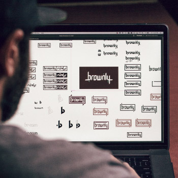
We wanted to incorporate the Urdu script in way that was clear but not tacky. I began writing out the name in the Nastaliq script because of its embellishments and flourishes. When it came time to incorporating that style into the Roman English lettering, it started feeling cheap and almost caricaturesque.
I then played around with the Kufic script - a blocky, geometric style. The thick lines and sharp edges of the Kufic script integrated nicely into the Roman English characters keeping the letterforms legible, while retaining essence of the Urdu script. The final the element to help tie it back to our heritage was adding nuqtas (diacritic marks) to the characters whose Urdu counterparts require them.


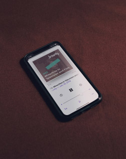
Using Audiotool, I created the instrumental and synth beats. I then brought them into Adobe Audition to put everything together and master the track. The result was theme music that I think captured the musical tones of our South Asian roots and our American upbringing. You can listen to it below along with some clips from the show.
Throw on some headphones and listen to the track — let me know what you think!
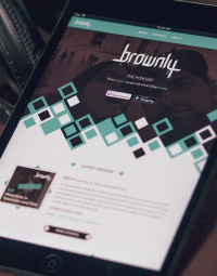
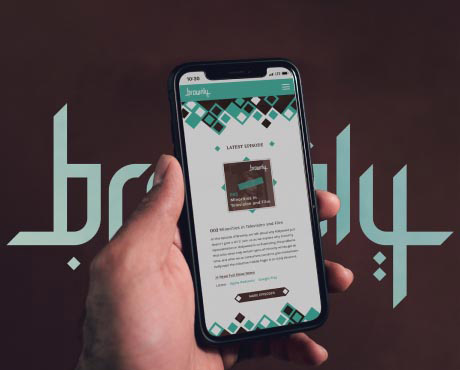
We wanted the website to be simple and serve only two funcitons: let people know where they could listen to the podcast, and tell people who we are and what the podcast was about.
I created geometric pattern reminiscent of Islamic architecture based on nuqtas from the logo to expand the visual language. These diamond shapes of different sizes and colors also represent the unique voices and perspectives we wanted to highlight.


Sometimes, life gets so hectic that a great idea needs to take the backseat. Between our full-time jobs, conflicting afterwork schedules, and living over 1,500 miles away from each other, we couldn't come up with a schedule to produce episodes regularly.
We’ve had to put Brownly on an indefinite hiatus. Who knows — maybe one day soon we’ll get back to it? Never say never...

I really hesitated adding this project to my portfolio. As of now, Brownly is still just a concept. So why am I highlighting it?
It’s simple: I’m proud of what we created, and I learned some great lessons in the process.
